From Vision to Symbol
Humble Beginnings to a Beacon of Hope and Resilience
In the world of advocacy, a logo is more than just a visual mark it’s a symbol of purpose, a rallying cry for change, and a reflection of an organization’s soul. At Breaking The Silence on Domestic Violence (BTSDV), our logos have evolved alongside our mission to empower survivors, raise awareness, and foster a community of support. Founded with a passion to shatter the stigma surrounding domestic violence, BTSDV has grown from a grassroots initiative into a vital resource for education, prevention, and healing. As we trace the journey of our logos, you’ll see how each one captures a phase of our growth, drawing on powerful symbols like the purple ribbon a global emblem of domestic violence awareness to evoke empathy, strength, and transformation.
Join us as we explore this evolution, from our founder’s original design to the vibrant symbol we proudly use today. Through it all, our core message remains: silence ends here, and hope begins.
The Original Logo: A Founder's Heartfelt Spark
Our story starts with simplicity and raw emotion. Crafted personally by our founder, the first logo featured a striking purple ribbon, looped elegantly with the acronym “BTSDV” inscribed along its folds. Set against a stark black background, it was unadorned yet profoundly impactful a direct nod to the awareness ribbons used in advocacy campaigns worldwide.
This design embodied the essence of our beginnings: a call to action born from personal conviction. The purple hue, long associated with domestic violence awareness, represented courage, survival, and the fight against injustice. The ribbon’s fluid form suggested unity and continuity, reminding us that breaking the silence is an ongoing journey. For our founder, this logo was a quiet rebellion a visual whisper that grew into a roar, inviting survivors and allies to step out of the shadows. It laid the groundwork for BTSDV, symbolizing empathy and the initial spark that ignited our movement.
Though modest, this logo carried immense emotional weight, resonating with those who felt unseen and unheard. It was a testament to the power of starting small, proving that even a single voice can spark widespread change.
The Secondary Logo: Embracing Growth and Renewal
As BTSDV expanded hosting workshops, building partnerships, and amplifying survivor stories our visual identity needed to reflect this maturation. Enter the secondary logo: a dynamic purple leaf-like structure, composed of flowing, parallel lines that curved gracefully into a pointed tip, evoking a flame or a budding plant reaching toward the light. Below it sat the golden “BTSDV” text in a bold, serif font, integrated with a small purple ribbon, and the tagline “Breaking The Silence On Domestic Violence” in crisp white lettering.
This evolution marked a shift toward themes of growth and resilience. The leaf symbolized renewal, much like how survivors emerge stronger from adversity, their experiences shaping them into forces of positive change. The intricate lines added depth and movement, suggesting the complexity of healing journeys and the interconnectedness of our community. Gold accents brought warmth and optimism, balancing the intensity of purple to convey hope amid struggle.
During this phase, the logo accompanied our growing initiatives, from online campaigns to community events. It captured the emotion of progress the pain of the past transforming into purposeful action. While it served us well, it also set the stage for something even more profound, as we sought a symbol that fully encapsulated our holistic approach to empowerment.
The Current Logo: A Masterful Bloom of Strength and Inspiration
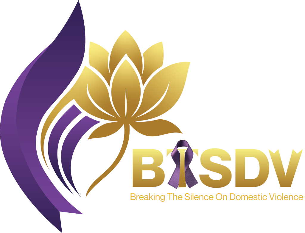
Today, we stand tall with our current logo a stunning fusion that truly embodies the heart of BTSDV. This design is our crowning achievement, a visual masterpiece that demands attention and stirs the soul. Here’s a closer look at its key elements:
- Core Symbol: The Radiant Golden Lotus Flower – At the heart of the logo, this iconic flower represents purity, enlightenment, and rebirth, symbolizing how survivors rise pristine from the “muddy waters” of adversity to bloom with unbreakable strength.
- Base Structure: Sweeping Purple Ribbon-Like Base – Emerging as the foundation, this flows with elegant, layered gradients, tying back to our roots in domestic violence awareness while evoking unity and the fluid journey of healing.
- Text Elements: “BTSDV” Acronym and Tagline – The acronym gleams in rich gold above a subtle purple ribbon accent, with the tagline “Breaking The Silence On Domestic Violence” appearing in matching gold below, adding warmth, victory, and a sense of inherent worth to every individual we serve.
What makes this logo so special? It’s not just aesthetically refined; it’s emotionally resonant. The fluid integration of the ribbon and lotus mirrors our comprehensive programs from crisis support and legal advocacy to wellness workshops and youth education. We’ve emphasized fluidity to evoke the ongoing flow of healing, with subtle gradients adding layers of depth. In a world where domestic violence affects millions, this logo serves as a beacon: a reminder that transformation is possible, that silence can be shattered, and that community can heal wounds.
Our current logo has become synonymous with BTSDV’s impact. It’s featured on our website, social media, merchandise, and events, drawing in supporters and survivors alike. Feedback from our community highlights its power one survivor shared, “Seeing that lotus makes me feel seen and strong, like I’m not alone in rising up.” As we continue to innovate, this logo will guide us, symbolizing not just where we’ve been, but the boundless potential ahead.
Looking Forward: A Logo That Lives and Breathes Our Mission
The evolution of BTSDV’s logos is a mirror to our own story: from a founder’s passionate start, through phases of growth, to a symbol of enduring hope. Each iteration has built on the last, but our current lotus design stands out as the pinnacle elegant, meaningful, and profoundly moving.
At BTSDV, we’re more than an organization; we’re a movement. If you’re inspired by our journey, join us in breaking the silence. Visit btsdv.ca to learn more, share your story, or get involved. Together, we can ensure that every survivor blooms into their fullest potential.
What do you think of our logo evolution? Share your thoughts in the comments below we’d love to hear from you!